The Brief
With just under two weeks before launch, I was brought in to define the visual identity of the event and build its core assets. This included designing the brand from the ground up, creating social media and promotional materials, and delivering flexible website templates for their CMS, Evessio.
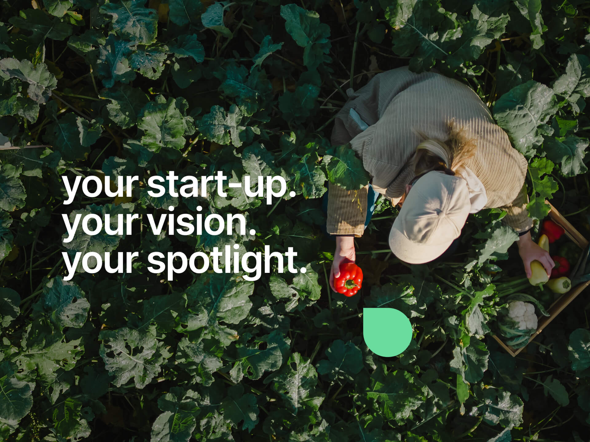
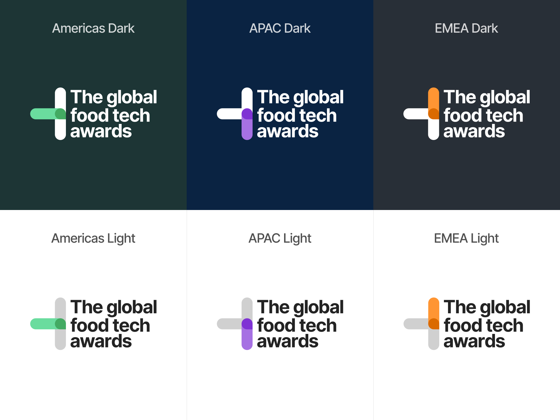
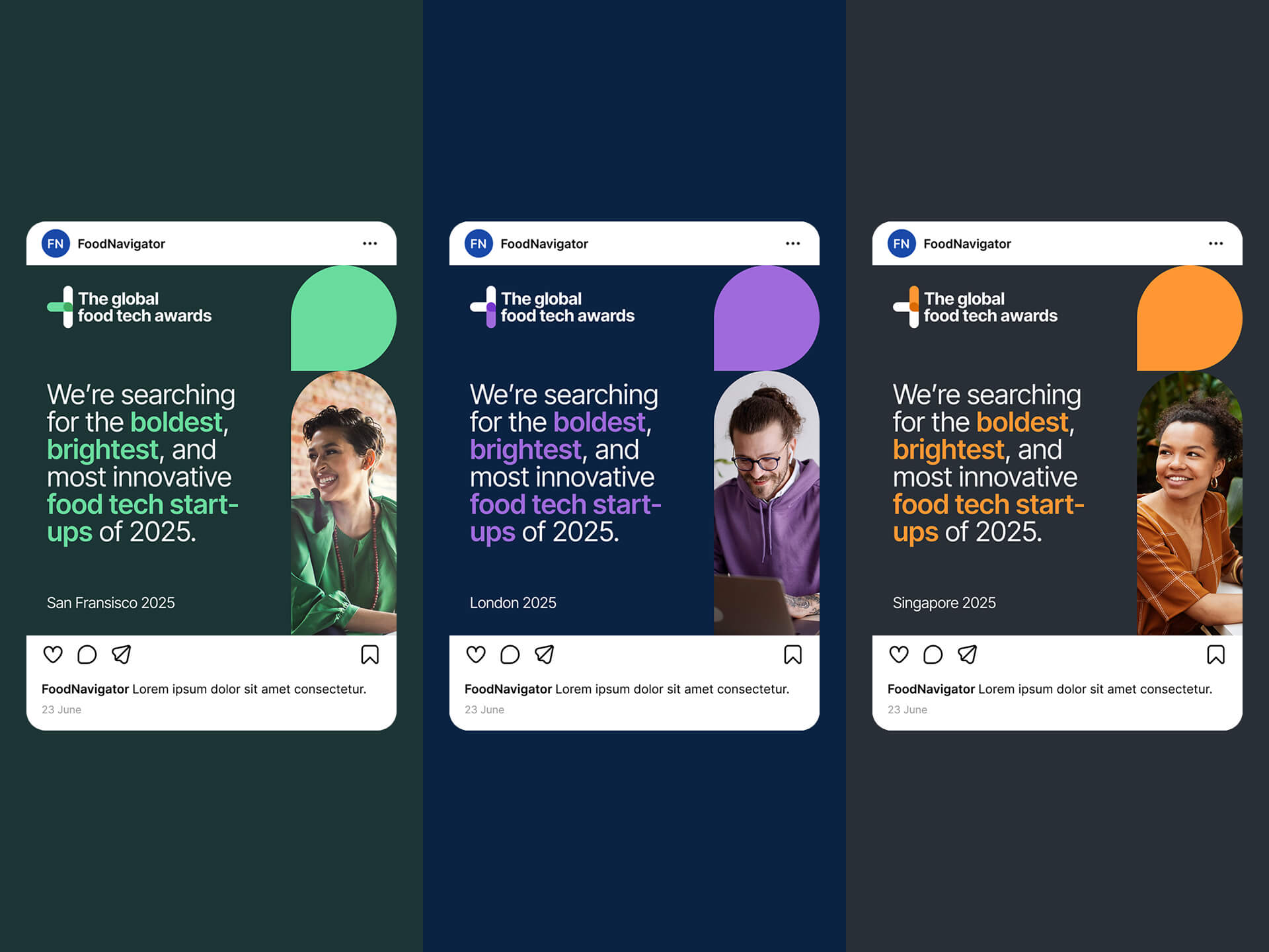
The awards were structured around three themed “heats,” and the team wanted each heat to feel distinct. The brand needed to shift between colour palettes and visual cues while still maintaining cohesion. At the same time, the identity had to speak to a start-up audience that are modern, vibrant, and energetic, without alienating the event’s more traditional B2B partners.
Brand ideation
The initial creative direction centred around the idea of using fruit icons to represent each heat. I explored a series of concepts using flat, geometric iconography paired with bold colour blocks and playful compositions. This approach helped capture the innovation and energy of the food tech sector, while offering a clear way to visually distinguish the heats.
After reviewing the early proposals, the team decided to move in a more corporate direction, stepping away from fruit imagery in favour of a cleaner B2B style. However, they were still keen to retain the flexibility and boldness of the original idea.
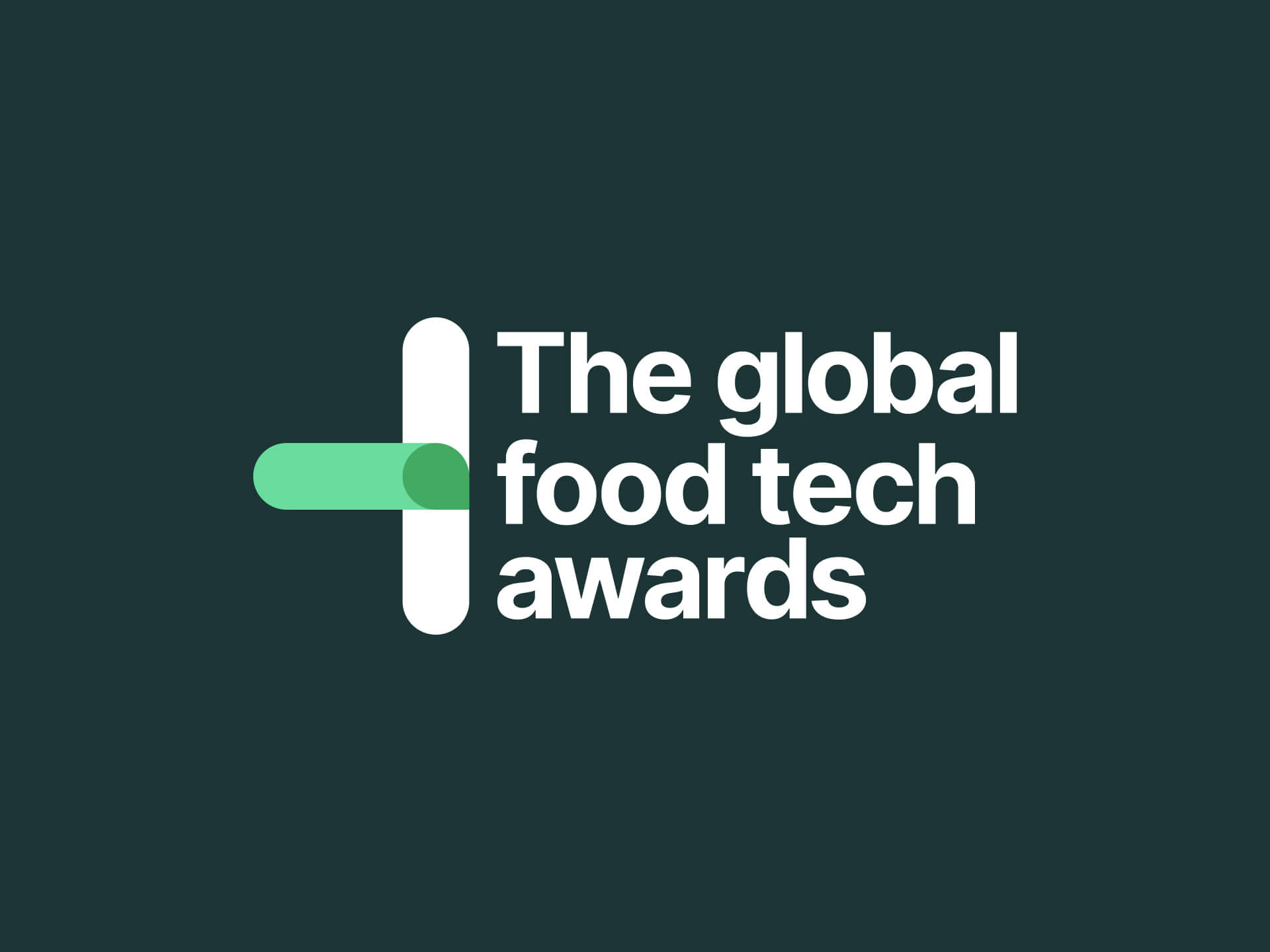
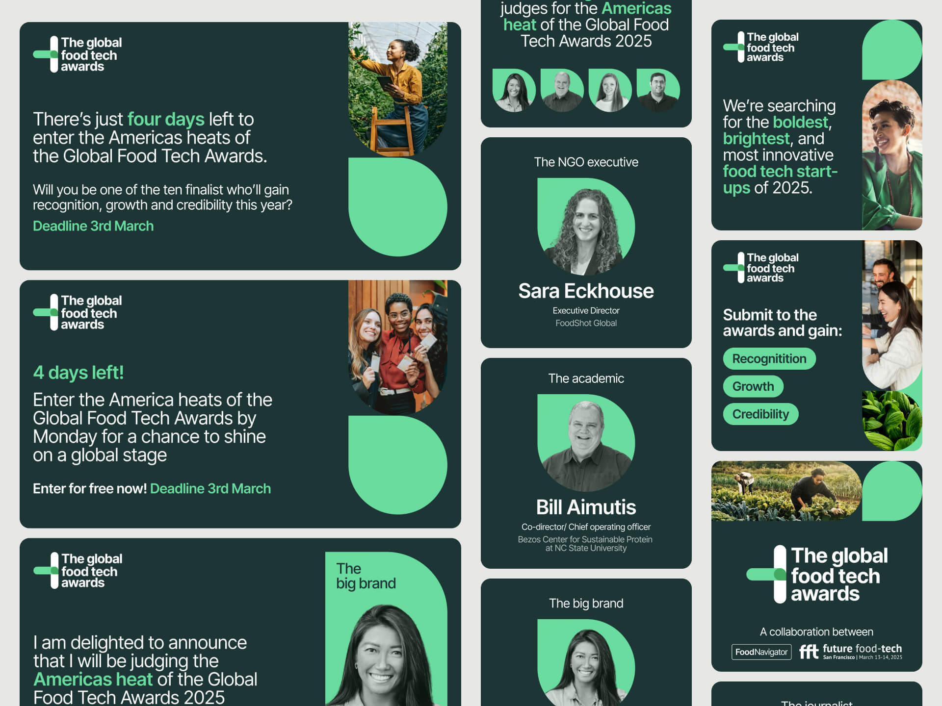
I shifted the focus toward a modular brand system, anchored by a logo that used directional arrows to signify movement and progression. Each “heat” was assigned a colour, with the active one highlighted via the arrow. This created a dynamic visual hook that could adapt across all digital and social assets without compromising consistency.
Brand finalisaiton
The final brand toolkit included a logo suite, colour palette system, typography guidelines, and layout rules, alongside creative assets for promotion, including banners, social templates, and visual markers for each heat.
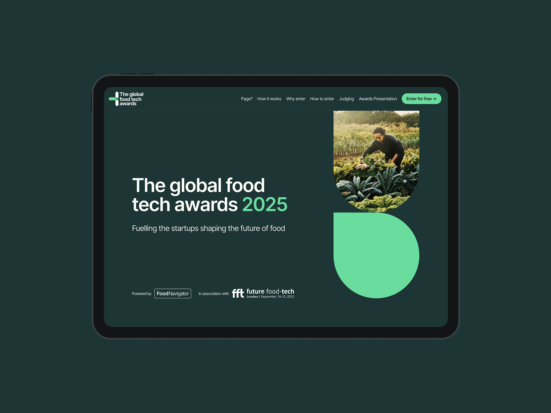
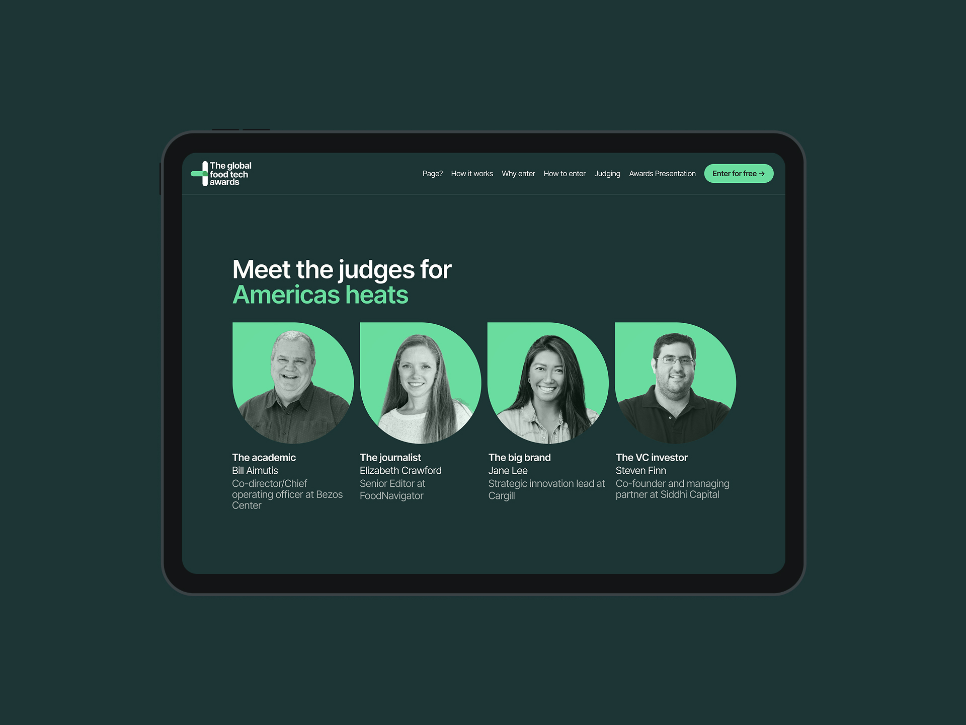
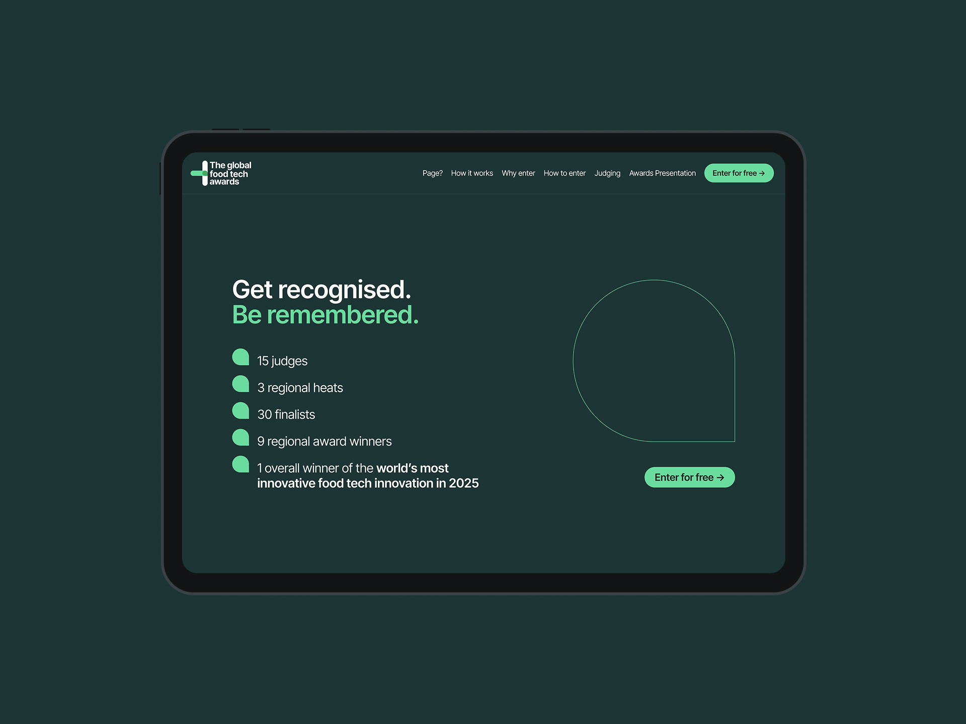
Website design
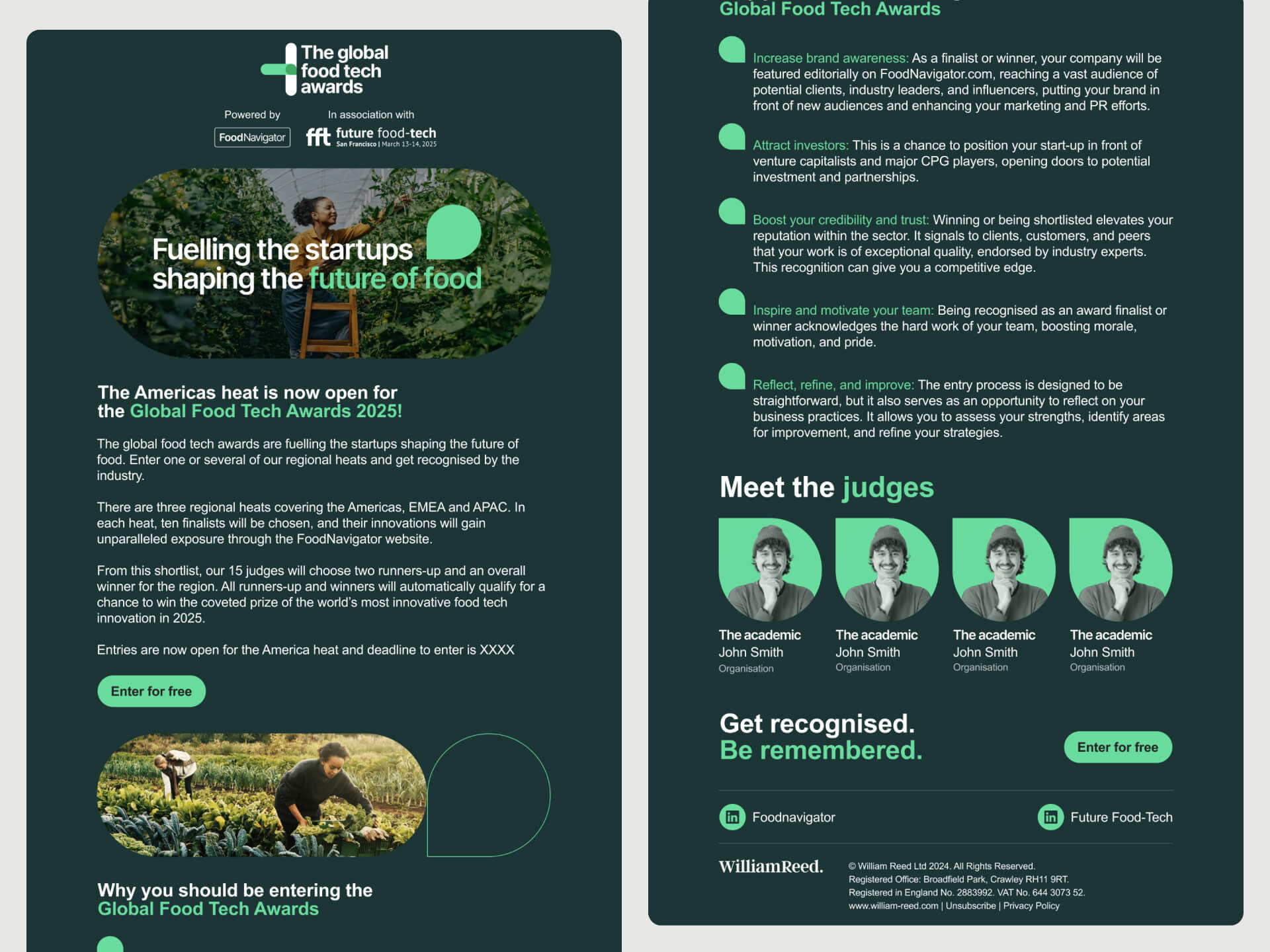
The final part of the project was designing and building event pages within Evessio, the CMS platform used by the team. The goal was to create a contemporary, streamlined interface that delivered key information clearly and efficiently. I designed clean, modular templates that prioritised readability and hierarchy, while remaining flexible enough to support changing content as the event progressed.
The site needed to speak to both sides of the audience: cutting-edge food start-ups and industry investors. With that in mind, I kept the layout focused, restrained, and accessible, ensuring the branding and tone carried through without getting in the way of the content