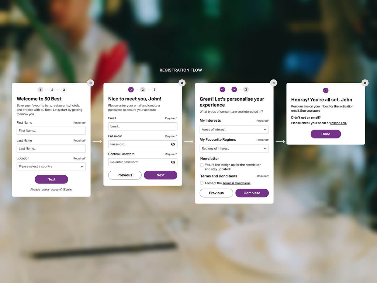
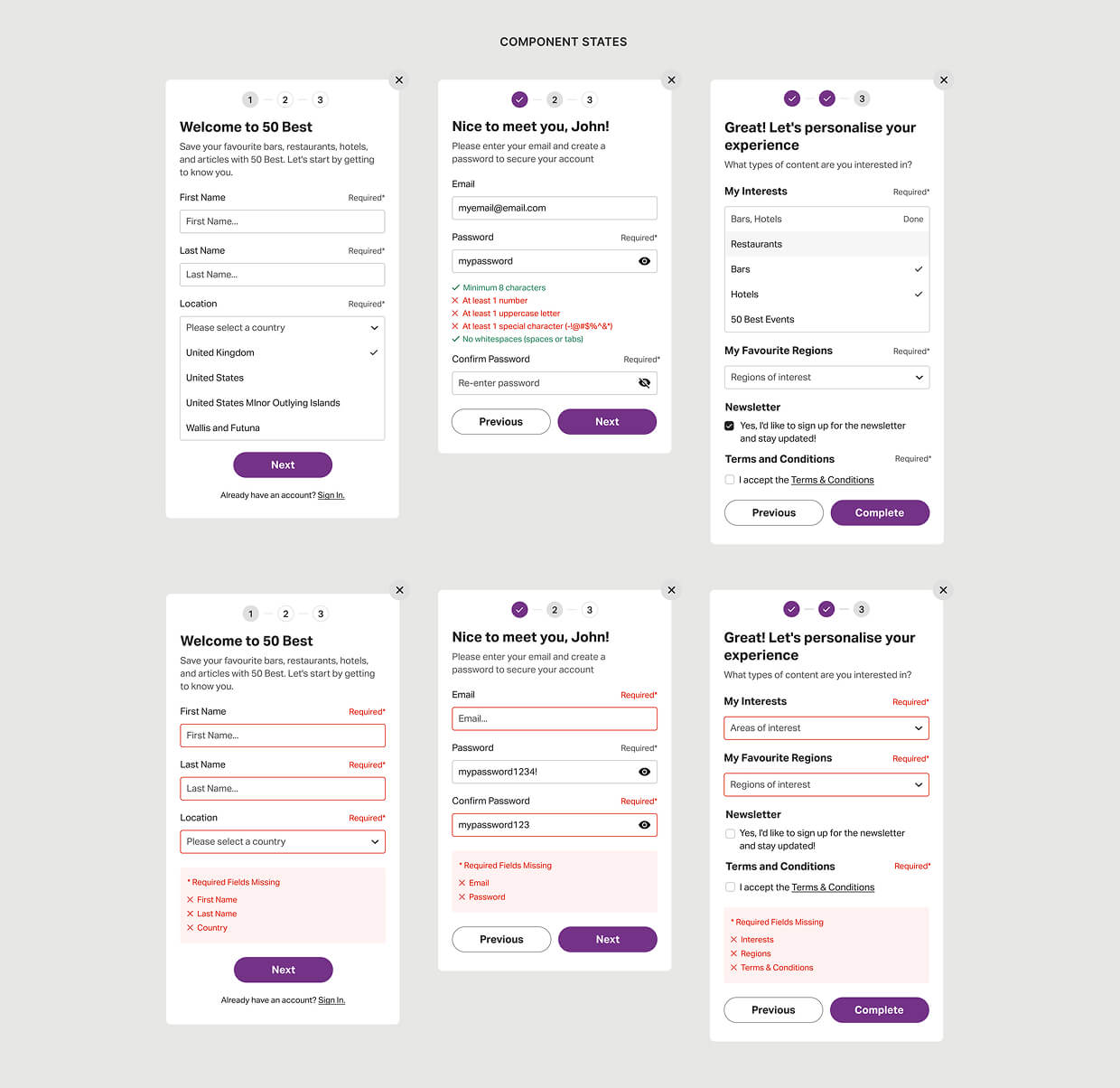
Registration Flow
One of the early challenges was designing a user-friendly registration experience that collected meaningful data without overwhelming users. Drawing on best UX practices, such as Hick's Law, I proposed a multi-step flow that simplified the process.
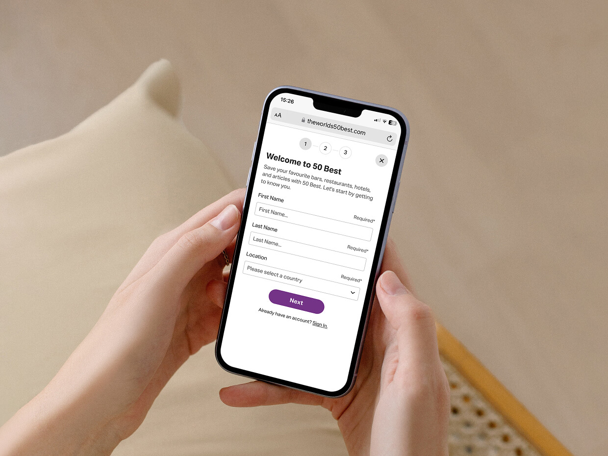
Rather than redirecting users to a long form, registration was broken into manageable steps that were presented one at a time using card components. Each step gave users a sense of progression, with visual cues to show completed stages.
This helped maintain the user's focus and kept them engaged in the context of the page they were already interacting with. The goal was to make registration feel like a seamless part of the broader experience, not an interruption to it.
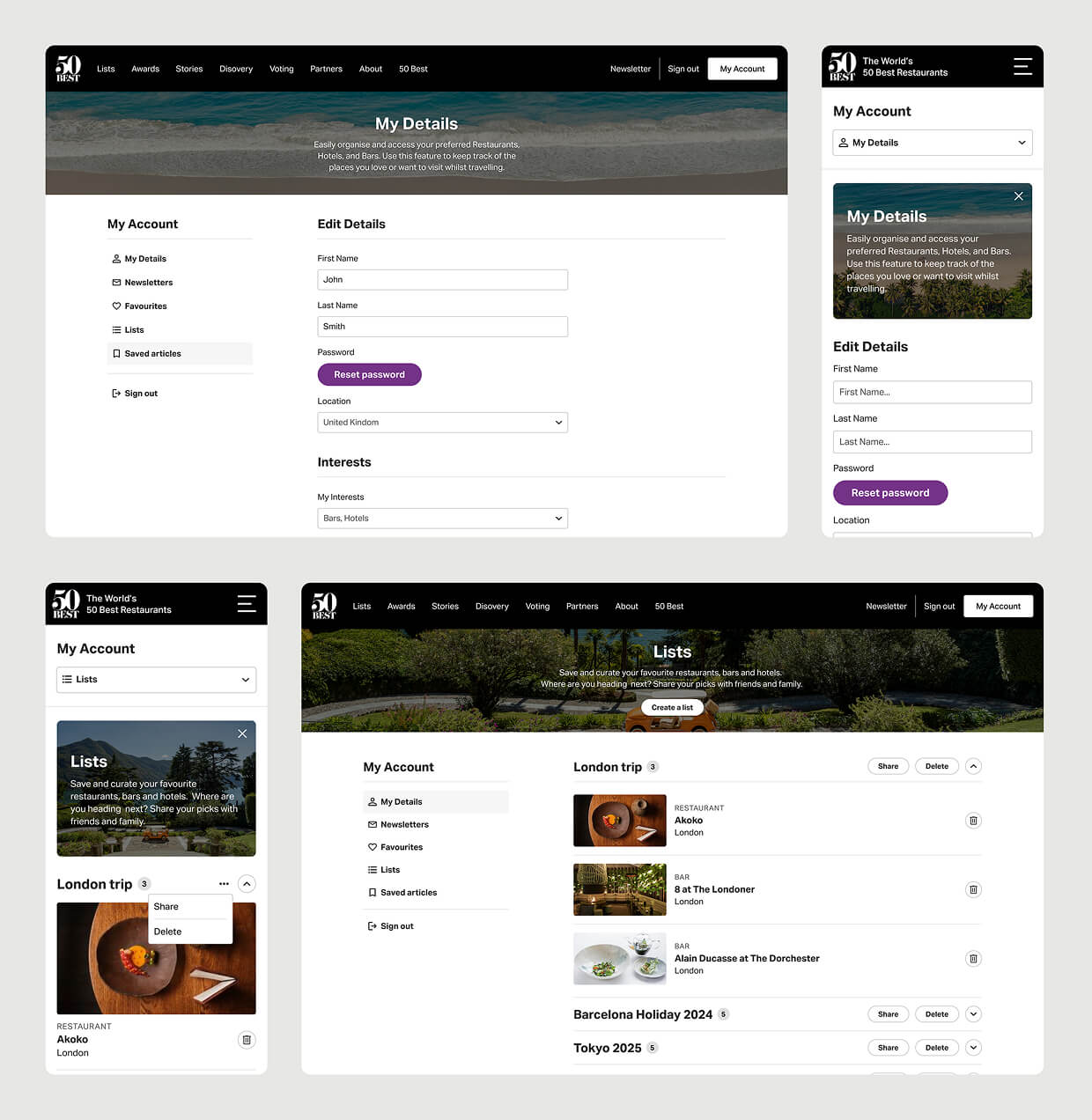
Logged in experience
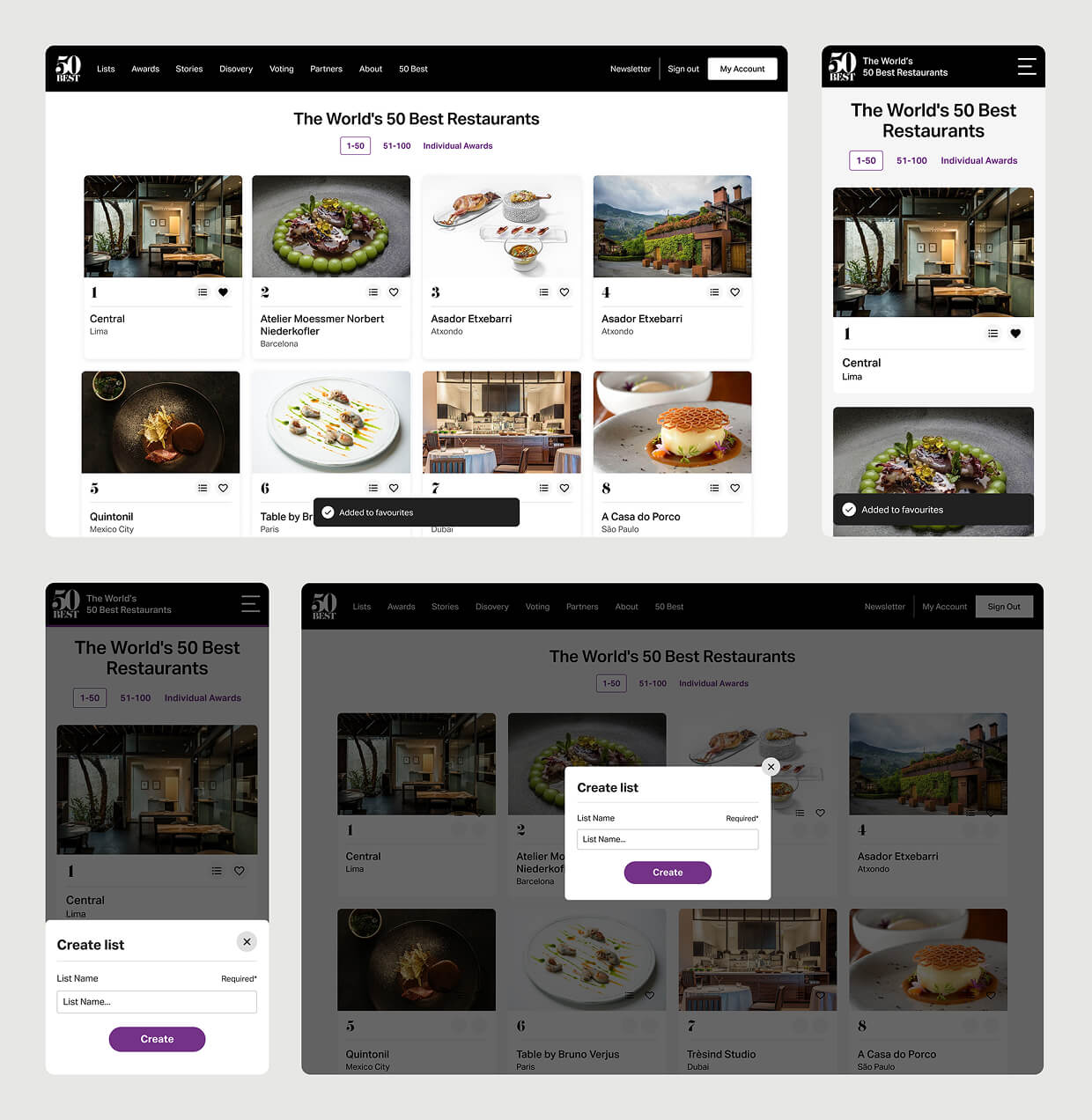
Once registered, users were brought into a new logged-in environment that opened up the full capabilities of the Preference Centre. I designed a dashboard that allowed users to manage their favourites, build and edit lists, update personal information, and control their content preferences.
The dashboard interface prioritised simplicity and clarity, with easy access to each feature through clean navigation and well-structured layouts. The overall experience was designed to be welcoming and intuitive, encouraging users to return regularly and interact with the content in a way that felt tailored to them.
Interactive elements
To support the new functionality without overhauling the existing site design, I created interactive UI components that integrated smoothly into the current system.
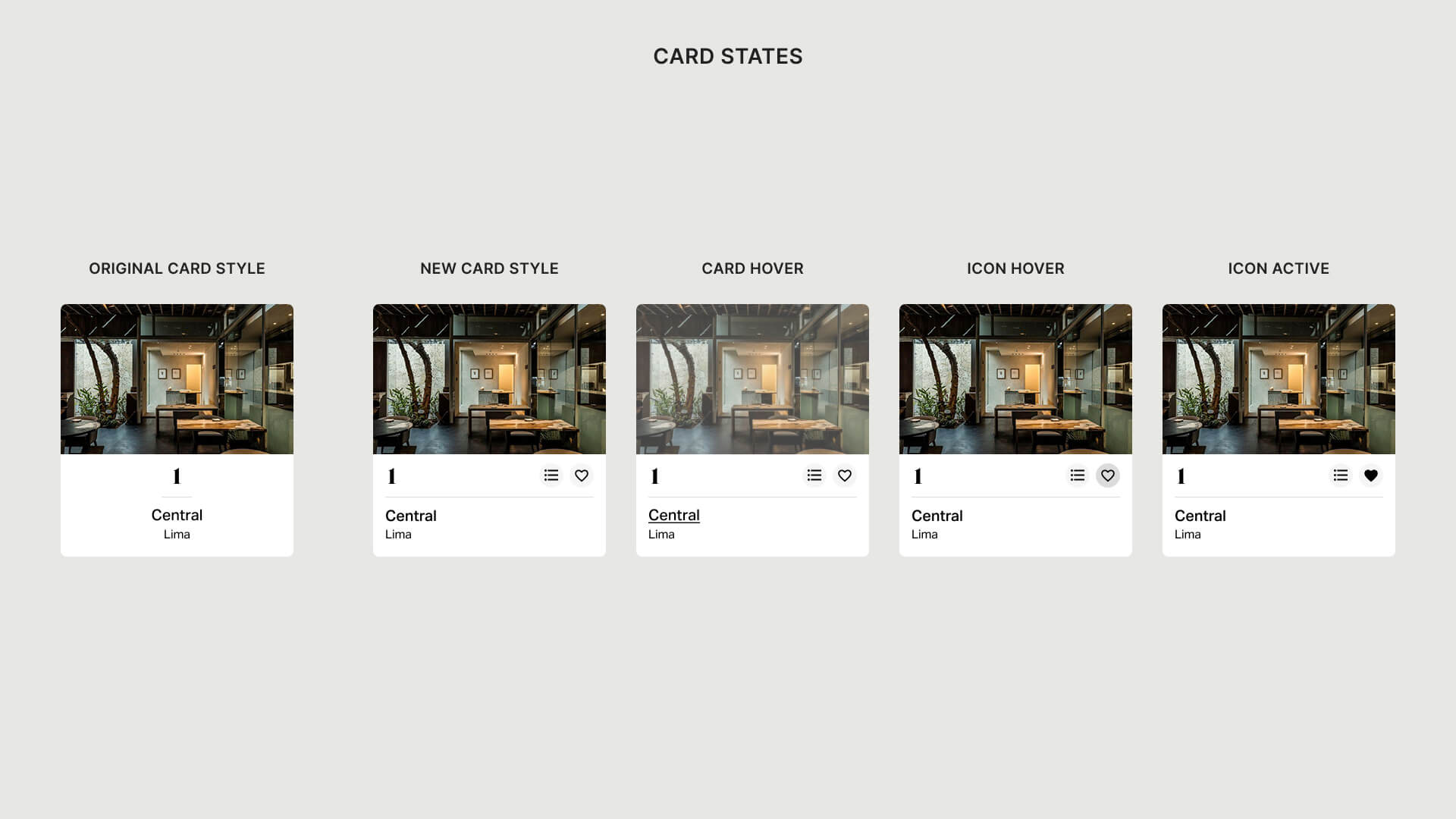
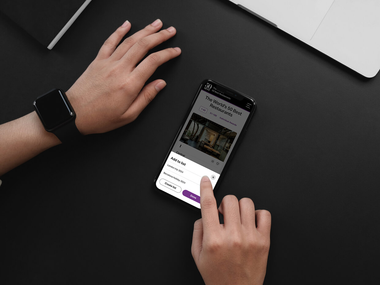
I designed “favourite” and “add to list” icons that appeared on establishment cards and profiles. These elements were crafted to match the site’s visual style while remaining easy to use and visually distinct.
The goal was to introduce new capabilities without disrupting the familiar look and feel of the brand. These micro-interactions were also designed with touch targets and accessibility in mind, ensuring a smooth experience across devices.